Short answer: a good wrap prompt names four things — the finish, the colour anchored to something real, where the design travels across the body, and what the accents do. Miss any of them and the model fills the gap with something generic.
"Blue wrap" is a request that leaves almost every decision to the machine. What comes back is a blue car, and it is nobody's fault that it is boring.
Here is how to describe a wrap so the render matches what is in your head.
What the model is actually generating
Worth knowing, because it explains most of the advice below.
When you describe a wrap, the model is not painting a picture of a car. It is generating the flat template image — a map of the body's surfaces — that then gets wrapped onto the 3D model. Our visualizer guide covers the mechanism in detail.
Two practical consequences fall out of that:
Do not describe the car. The vehicle is already fixed by the template you picked. Words spent on "sleek electric sedan" are words not spent on the wrap, and they can actively muddy the result.
Surfaces beat objects. A finish, a texture or a gradient survives being cut apart and mapped around a three-dimensional shape. A single coherent object — a dragon, a portrait, a logo the size of a door — has to stay recognisable through that distortion, and often does not. Designs that are about the surface are dramatically more reliable than designs that are about a picture.
The four things to name
1. The finish
This is the most valuable word in the prompt and the one most often left out. "Matte", "satin", "gloss", "metallic", "pearl", "brushed", "textured". It changes the entire character of the render.
Say "satin" and you get soft sheen. Say nothing and you get whatever the model's default is, which is usually a mid-gloss that looks like every other render.
If you are not sure which you want, generate the same colour three times with three different finish words and compare. Our matte, gloss and satin comparison covers what each actually means to live with.
2. The colour, anchored to something physical
Generative models treat colour words loosely and hex codes very loosely. What they handle well is colour anchored to a real thing.
| Vague | Anchored |
|---|---|
| "nice blue" | "deep navy, like ink" |
| "grey" | "nardo grey" |
| "green" | "the green of a dark bottle" |
| "#B87333" | "oxidised copper" |
| "orange" | "burnt terracotta" |
Named film colours work particularly well because they appear in the training data attached to actual cars. Real-world materials — copper, slate, bone, moss, gunmetal — work almost as well and are easier to think of.
3. Where the design travels
This is the specific that most separates a design from a paint sample, and almost nobody includes it.
The body has a front, a back, a roof and a lower edge. Say what happens across them.
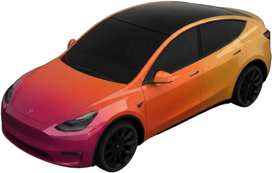
- "darker at the nose, lightening toward the rear"
- "colour concentrated along the lower half, roof left dark"
- "a fade that starts behind the front wheel"
- "split horizontally at the shoulder line"
- "gradient running front to back, not top to bottom"
That last example matters more than it looks like it should: a gradient with no stated direction may well come back running vertically, which is almost never what anyone wants.
Body shape affects what works here. Long sedans give a gradient room to travel; tall crossovers are better served by horizontal splits. The Model S page and the Model Y page show the same idea landing differently on different proportions.
4. What the accents do
Mirrors, roof, lower panels, pillars. Naming them gives the design structure rather than a single flat tone.
"…with gloss black mirrors and roof" or "…carbon-fibre accents on the lower panels" turns a colour into a design with a hierarchy. It also happens to mirror how real wraps are actually specified, which is probably why it works so well.
Putting it together
Weak:
blue wrap
Better:
satin navy blue
Good:
satin deep navy, lightening toward the rear, with gloss black mirrors and roof
Each version adds one of the four specifics. The last one is still a single readable line — this is not about writing paragraphs.
A few more that follow the pattern:
matte military green with carbon-fibre accents on the mirrors and lower panels
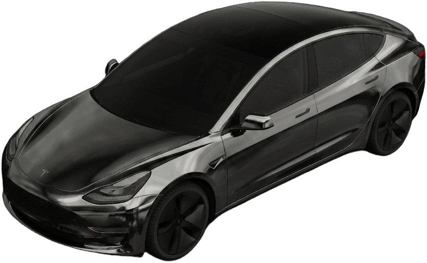
liquid chrome in graphite black, mirror-smooth, subtle blue reflections
satin pearl white with a faint icy blue shift in the light
forged carbon base with a red-and-white racing livery down the sides
There are more of these, each attached to a render you can open directly, on the wrap ideas page.
Refine one variable at a time
This is the habit that separates people who get what they wanted from people who generate twenty things and settle.
When a render is close but not right, change one thing. The finish, or the accent colour, or where the gradient starts. Then look at what moved.
Rewriting the whole prompt each time turns a design process into a slot machine. You get variety, you learn nothing, and you cannot get back to the one you liked three attempts ago.
Keep the ones that are close. It is common to end up combining the colour from one attempt with the layout from another, and you can only do that if you still have both.
Four failure patterns and their fixes
It came back generic. You named a colour and nothing else. Add the finish and where the design travels.
The gradient runs the wrong way. State the direction explicitly. "Front to back" is a real instruction and models respect it.
Detail landed somewhere useless. Tight-curvature areas — wheel arches, the nose, mirror housings — distort heavily when the flat template maps onto the body. Keep anything you care about on doors, the roof and the rear quarters.
A specific object came out mangled. Objects have to survive being wrapped around a 3D shape. Either accept that it will be interpreted loosely, or shift toward a surface-led design that uses the object's style rather than the object itself.
Designs that consistently work
Across a lot of generations, some categories are simply more reliable than others:
- Finish-led — matte, satin, pearl, chrome, brushed metal. Almost always lands.
- Two-tone and splits — horizontal or diagonal, with a stated split line.
- Gradients with a direction — front to back, or light to dark across the body.
- Livery geometry — stripes, chevrons, racing graphics down the sides.
- Material textures — carbon, camo, marble, oxidised metal.
Angular bodies take graphic, high-contrast designs especially well, because flat panels barely distort when the template maps back — see the Cybertruck page for what that looks like.
Then look at it in the round
A prompt is only half the process. Rotate the result before you judge it: a design that is perfect in three-quarter view and incoherent from directly behind is a design you will regret, and you will only find that out by turning it. The 3D visualizer is the fastest way.
And when you have one you like, the next step is getting it to someone who can print it — covered in handing a wrap design to an installer.
Try a prompt now
The four specifics take about ten extra seconds to type and change the result completely. Pick a finish, anchor a colour, say where it travels, name the accents.
Open the design studio and try one on your exact model, or get the iOS app and design from your phone.